Prism Pages
Prism Pages is a bookstore that fights loneliness by providing a positive and safe community space for all. At Prism you’ll find books, a comfortable cafe to work in, and community clubs for all interests from knitting to local political and volunteer efforts.
Client
Prism Pages
Creative Direction, Copy, Design
Creative Direction
Prism customers are avid readers and lifelong learners who value inclusivity, curiosity and seek to build authentic community connections. The creative direction strives to find balance in old-school, cozy, academia and the joyous vibrancy of diverse community and building new connections.
Color Palette
The palette boldly jumps to embrace a rainbow aesthetic — a nod to Prism’s queer patrons — while being tempered with soft tones.


Typography
The main heading features a clean, easy to read block font that is bold and simple enough to support the full spectrum of the rainbow. Contrast is found in the more elegant, academic leaning subheadings and playful accent text.


Prints Assets
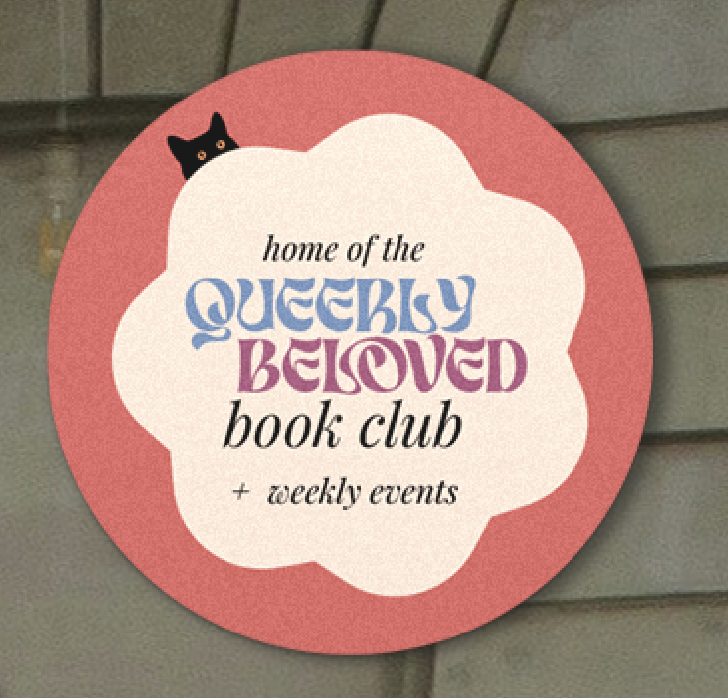
The Logo Suite
The logo suite leans into color, while providing three core variations that are suitable for different uses: 1) an academic leaning, heavy style that pays homage to Prism’s house cat, 2) a vibrant version that catches eyes and is well suited for document headers and places requiring high legibility and 3) a more playful version nestled between “stacked books” that works well on merch.