
The Scoop
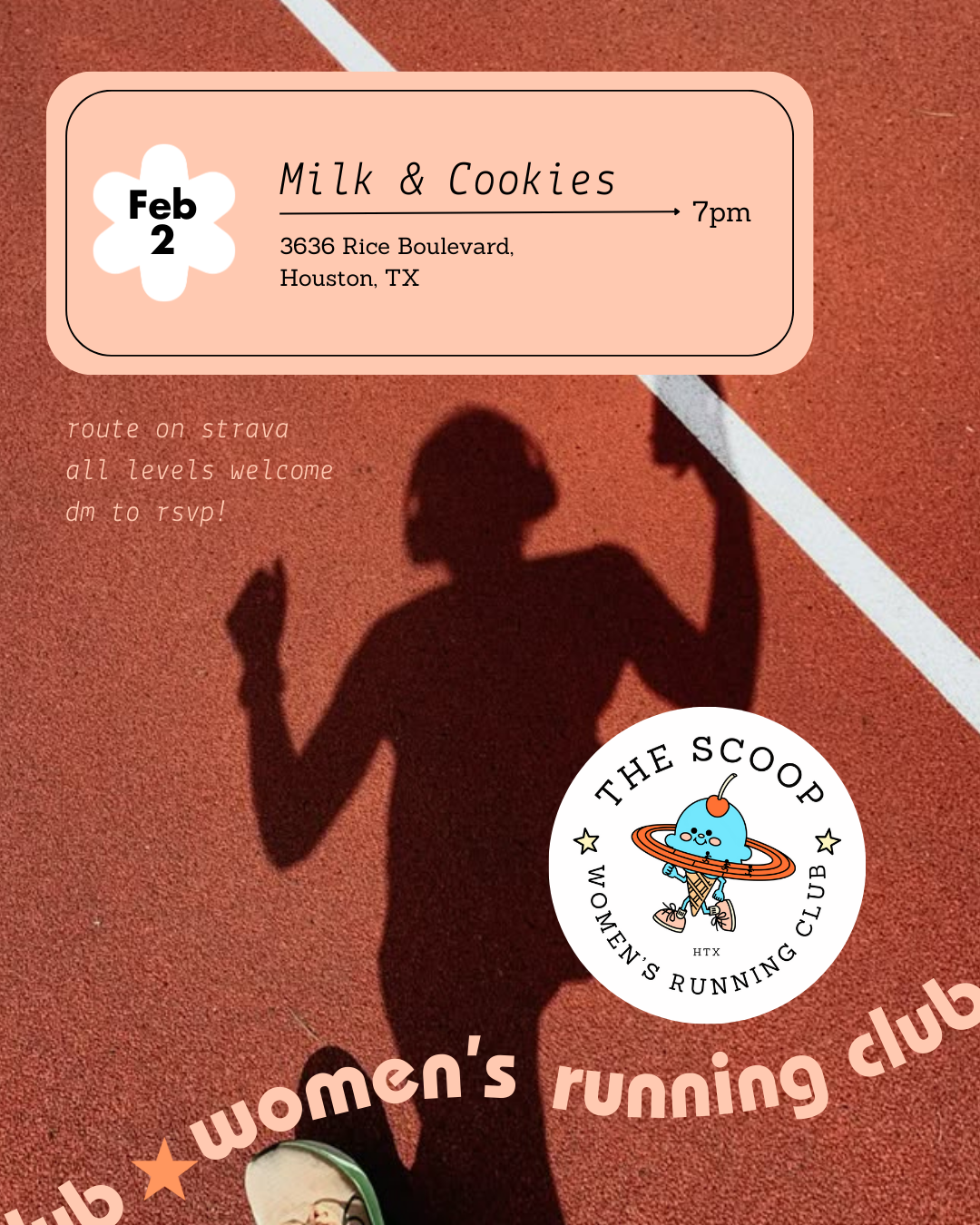
The Scoop is an all-levels, woman’s running club based out of Houston, TX. Every other Tuesday the club meets at a new ice cream shop for a fresh route followed by a fun, post-run treat and social gathering.
Client
The Scoop
Brand Refresh, Social Media Collateral
Creative Direction
The Scoop had a logo and color palette in place, but needed an expanded visual concept and easy-to-implement core guidelines.
We went with a cute, retro, sporty look that recalls both old school running and the nostalgia associated with ice cream parlors. This result: a brand that stands out among other run clubs and more cohesive image on social media.

Color Palette
The Scoop had a color palette in place, but we added a few guidelines for use that made the colors easier to work in and resulted in a more cohesive brand look.

Social Media Collateral


Type Suite
The expanded type suite adds visual intrigue a more specific feel. ITC Bauhaus references old school, sporting designs, while Futura Extra Black adds contemporary edge. The thin lines of Lekton and Sanchez keep the brand feeling down-to-earth and approachable.

Brand Imagery
Colors: Desaturated reds, greens blues
Vibes: Retro, Girl Gang, Diverse, Friendly, Casual


